The 5 Golden Rules of Data Visualization

Bad data visualizations are not just ugly. They are dangerous.
A bad data visualization doesn’t just look unprofessional. It can make a good decision look bad, a small change look dramatic, or a serious problem look harmless.
And the worst part? Most misleading data visualizations are not created by people trying to manipulate others. They are created by normal people who made small design mistakes.
The data may be correct.
The conclusion may be wrong.
Because the visualization is wrong.
Data visualization is not decoration. It’s decision-making.
If a visualization is confusing, misleading, or hard to read, it is not a design problem ,it’s a communication problem.
Over the years, a few fundamental principles have emerged from the work of people like Edward Tufte, Stephen Few, Alberto Cairo, and many others. If you follow these principles, your visualizations will already be better than most of what people see in reports, dashboards, and presentations every day.
I have been teaching data visulizaiton to data science student over the past few years at the University Paris Cité, and working in the data industry in various sectors for over 12 years, with companies operating in all continents.
The observations I’ve made are undeniable, because when the same erros and misunderstandings happens over and over again, it is not a “tools” issue, nor a “data” issue, it is far deeper then that.
This year, I’ve changed my teaching syllabus to focus on what I thought was more important than teaching students how to code with R or Python.
My teaching focus became more practical with a major idea: To build successful visulizations, there are rules to follow.
In this article, i’ll try to summarize my top 5 rules as a start. Since the topic is one of my favorite ( yes yes!) further work will be published with a little bit more details, but for the sake of this poste, H-here are the five golden rules of Data Visulization:
🥇 Rule 1 : Always give the visualization a clear title
A visualization without a title is a puzzle. And people are busy — they won’t solve your puzzle. A good title answers one simple question:
What am I looking at, and why does it matter?
Why this matters? Without a title, your reader has to guess:
- What is this visualization about?
- What time period?
- What metric?
- What is the main takeaway?
Most people won’t guess. They’ll just move on.
If your visualization needs a paragraph to be understood, your title failed.

Bad vs corrected example
In the example above, both visualizations show the same data.
But the one on the left has no title — we see bars, categories, and values, but we don’t know what the visualization represents.
Is this revenue? Number of users? Orders? Visits? Over what period?
On the right, the visualization includes a clear title:
“Website Visits by Acquisition Channel in March 2026.”
Nothing else changed. Same data. Same visualization. Same layout.
But the interpretation effort for the reader is completely different.
The title does not just name the variables , it provides context.
And context is what turns a graphic into information.
Practical takeaway
Your title should answer these three questions:
- What is being measured?
- Over what period?
- For what group or category?
A good title is not: “Visits”
A good title is: “Website Visits by Acquisition Channel in March 2026”
A data visualization without a title forces the reader to work.
A good title does the work for the reader.
🥇 Rule 2 : Label your axes and include units
A data visualization without axis labels is a visualization that hides information.
It may look clean. It may look professional.
But if the axes are not labeled, the reader does not actually know what they are looking at.

Why this matters
In the example above, both visualizations show the same line and the same values.
But in the visualization on the left, the axes are not labeled.
We see numbers on the vertical axis — but what are they?
- Euros?
- Thousands of euros?
- Profit?
- Number of customers?
- Percentage?
We see months on the horizontal axis — but what is being measured over time?
Without axis labels and units, the reader is forced to guess.
And when readers guess, they can misunderstand.
Numbers without units are ambiguous.
Ambiguity is the enemy of good data visualization.
Corrected example
On the right, nothing about the data changed. The only difference is that the axes are now labeled:
- X-axis: Month
- Y-axis: Revenue (k€)
In addition, the title reinforces what the reader is looking at: Monthly Revenue.
This small change removes ambiguity and makes the visualization immediately understandable.
Practical takeaway
Every axis label should answer two questions:
- What is being measured?
- In what unit?
For example:
- Revenue (€)
- Revenue (k€)
- Conversion Rate (%)
- Number of Users
- Time (days)
- Distance (km)
A good data visualization should be understandable without any explanation around it.
Axis labels and units make that possible.
🥇 Rule 3 : Never use misleading scales
This is where data visualization stops being just a design issue and becomes a decision-making issue.
In the example above, both visualizations show the same data: Brand B is slightly higher than Brand A.
But the visualization on the left truncates the y-axis — it starts around 94 instead of 0.
Visually, this makes the difference look dramatic.
In reality, the difference is very small.
Nothing about the data changed.
Only the scale changed.
But the story told by the visualization is completely different.
Why this matters
Our eyes don’t read numbers first — they read shapes and heights.
If one bar looks twice as tall as another, most people will intuitively believe the value is roughly twice as large, even if the actual difference is only a few percent.
This is why truncated axes are one of the most common sources of misleading data visualization in media, business reports, and presentations.
Edward Tufte called this the Lie Factor: when the visual difference is much larger than the numerical difference.
If you change the scale, you change the story.
Corrected example
On the right, the y-axis starts at zero.
Now the bars reflect the real difference between the two brands.
The difference looks smaller — because it is smaller.
The corrected visualization is less dramatic, but more honest.
And in data visualization, honesty is more important than drama.
Practical takeaway
- For bar charts, the axis should almost always start at zero.
- For line charts, zooming is acceptable, but it must be clearly visible and justified.
- Always ask yourself: “Am I showing the data, or am I exaggerating the difference?”
A misleading scale does not change the data — it changes the perception.

Why this matters
Our eyes judge shape, not numbers. If the scale is manipulated, the story is manipulated.
This is one of the oldest tricks in the book, often used in media, politics, and marketing.
If you change the scale, you change the story.
Bad example
Two bars with two different values: 100 and 95
But the y-axis starts at 94 instead of 0.
Visually, one bar looks twice as big as the other, even though the difference is only 5%.
This type of visualization has been used many times in TV news and political communication to exaggerate differences in polls or budgets.
Corrected version
Start the y-axis at 0 for bar visualizations.
Now the difference looks small , because it is small.
Practical takeaway
- Bar visualizations → axis should start at 0
- Line visualizations → you can zoom, but you must clearly show it
- When in doubt, choose honesty over drama
🥇 Rule 4 : Choose the right type of visualization
One of the most common mistakes in data visualization is not about colors or labels, it’s about choosing the wrong type of visualization for the question you are trying to answer.
In the example above, both visualizations use the same data: sales evolving from 2021 to 2025. But the visualization on the left uses a pie chart.
A pie chart is designed to show proportions at a single point in time.
It answers a question like: “How is the total divided?”
But here, the real question is different. The real question is:
“How did sales change over time?”
A pie chart cannot show a trend. It hides the trend.
You can see percentages, but you cannot clearly see the direction:
Are sales increasing? Decreasing? Stabilizing? The pie chart makes this hard to understand.
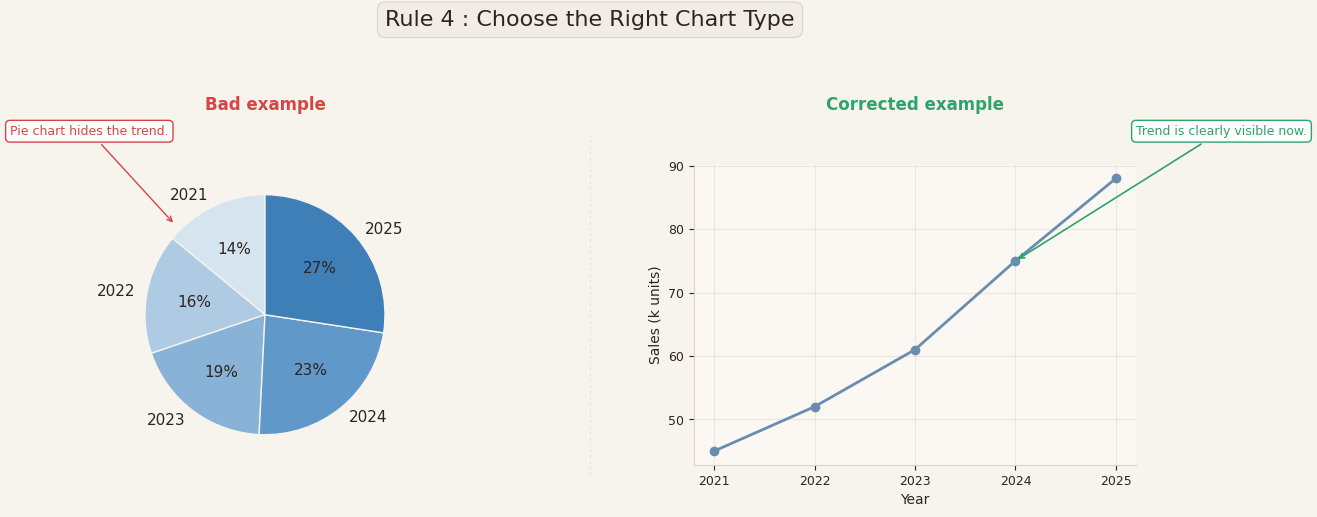
Corrected example
On the right, the same data is displayed using a line chart.
Now the message becomes immediately clear:
Sales are increasing every year, and the trend is easy to see.
Nothing about the data changed. Only the type of visualization changed. But the insight became obvious.
Why this matters
Each type of visualization is designed to answer a specific type of question.
- Bar charts are good for comparing categories.
- Line charts are good for showing evolution over time
- Pie charts are good for showing proportions.
- Histograms are good for showing distributions.
- Scatter plots are good for showing relationships between two variables.
When you choose the wrong type of visualization, you are making the reader work harder to understand something that should be obvious.
Practical takeaway
Before creating a visualization, ask yourself one simple question:
“What should the reader understand in less than 5 seconds?”
If the answer is:
- A comparison → use bars
- A trend → use a line
- A proportion → use a pie (with very few categories)
- A relationship → use a scatter plot
A good data visualization is not the one that looks nice.
It’s the one that makes the answer obvious.
🥇 Rule 5 : Use color with meaning, not decoration
Color is one of the most powerful tools in data visualization.
And also one of the most misused.
In the example above, both visualizations show the same data.
But in the visualization on the left, each bar has a different color.
The colors look nice, but they don’t mean anything.
They don’t represent categories, they don’t represent values, and they don’t help the reader understand the message. They just add visual noise.
When every element has a different color, the reader’s eye doesn’t know where to look.

Corrected example
On the right, most of the bars are shown in a neutral color, and one bar is highlighted in green.
Now color is used intentionally, to draw attention to the key category.
The reader immediately understands what matters in the visualization.
Nothing about the data changed. Only the use of color changed. But the message became much clearer.
Why this matters
Color should be used to communicate information, not to decorate the visualization.
In good data visualizations, color is typically used to:
- Highlight an important value
- Distinguish between categories
- Show a positive vs negative change
- Show groups or segments
- Guide the reader’s attention
If color does not serve one of these purposes, it is probably unnecessary.
Practical takeaway
When you use color, ask yourself:
“If this visualization was printed in black and white, would it still be understandable?”
If the answer is yes, then color is being used correctly — as a guide, not as a crutch.
A good rule to follow is:
- Use neutral colors (grey, light blue) for most elements
- Use one strong color to highlight what matters
In data visualization, color is not there to make the visualization pretty.
It is there to make the message clear.
My Conclusion : These rules are not optional
If you remember only one thing, remember this:
Clarity is not a luxury in data visualization. It is a responsibility.
A good visualization:
- Has a clear title
- Has labeled axes
- Uses honest scales
- Uses the right type of visualization
- Uses color with purpose
These are not advanced rules.
They are foundational rules.
And yet, most visualizations used in companies, reports, dashboards, and media break at least two of them.
Which leads to an interesting idea:
What if a Python library could automatically check your visualizations and warn you?
- “Missing title”
- “Axis not labeled”
- “Suspicious scale”
- “Too many colors”
- “Wrong visualization type for this data”
Not to replace the analyst, but to prevent avoidable mistakes.
Because most bad visualizations are not created out of malice.
They are created because no one checks the visualization.
Maybe, in the future, visualizations will come with a built-in “quality check”.
And maybe that should become the standard.
here is a quick personal note: I am currently working, in stealth mode for now, on a project around these “golden rules” of data visualization. My ambition is simple: I would like these rules to become a standard, not a recommendation.
If my students benefit from it, I’ll be more than happy. But the real goal is broader, to help analysts, data scientists, and practitioners build visualizations that are clearer, more honest, and more responsible. Because in the end, data visualization is not just about charts — it’s about how we understand the world through data.


