The Complete Guide to Python Data Visualization Libraries
The Complete Guide to Python Data Visualization Libraries
Python has become the go-to language for data visualization, and for good reason. Its ecosystem offers a tool for every situation, whether you are exploring a dataset for the first time, publishing a polished chart for a research paper, building an interactive dashboard, or rendering millions of data points without melting your browser tab.
The problem is that there are a lot of choices. Too many, arguably. If you have spent any time searching for “best Python visualization library,” you have probably come across a dozen names and felt more confused after than before.
This guide cuts through the noise. We cover the most important active libraries from the PyViz ecosystem, group them by what they are actually good at, explain what makes each one worth knowing, and give you enough context to pick the right tool for the job.
A companion Jupyter notebook with working code for every library is available alongside this article.
How to Read This Guide
The libraries are organized into groups based on their primary purpose. You do not need to learn all of them. A typical data scientist or analyst can get very far with just two or three. Use this as a reference to understand your options, then go deep on the ones that fit your workflow.
Group 1: The Foundation Layer
These are the libraries that almost everything else is built on top of. Whether you use them directly or not, you are almost certainly depending on them indirectly.
Matplotlib
Website: https://matplotlib.org
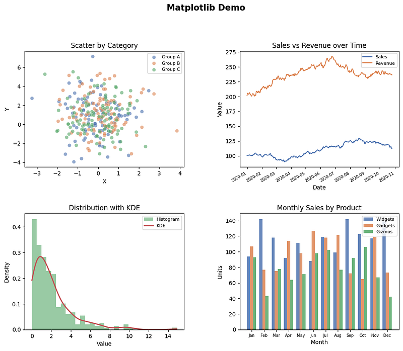
Matplotlib is the original Python plotting library and still the most widely used. Released in 2003, it was designed to bring MATLAB-style plotting to Python. Two decades later, it remains the backbone of scientific Python visualization.
What makes Matplotlib powerful is its level of control. You can customize almost every single element of a figure: font size, tick spacing, axis limits, line style, annotation position, figure size in inches, DPI for export, and on and on. If you need a chart that looks exactly a certain way, Matplotlib can get you there.
The tradeoff is verbosity. Creating a publication-quality chart with multiple panels, custom annotations, and careful typography takes quite a bit of code. But that code is explicit and reproducible, which matters a lot in scientific contexts.
Matplotlib also serves as the rendering backend for many higher-level libraries including Seaborn, Plotnine, and Missingno. Learning Matplotlib fundamentals pays dividends across the entire ecosystem.
Best for: Publication-quality static charts, full customization, scientific figures, integration with other libraries.
Plotly (Core)
Website: https://plotly.com/python

The core Plotly library is a low-level API for building interactive charts that render in a browser using JavaScript under the hood. It supports an enormous variety of chart types including 3D surface plots, Sankey diagrams, choropleth maps, sunburst charts, and treemaps alongside the usual line, bar, and scatter plots.
Plotly charts are interactive by default: you get hover tooltips, zoom, pan, and legend toggling out of the box. They export cleanly to HTML and can be embedded anywhere a browser can run.
The core API is fairly verbose, which is why most users reach for Plotly Express (covered below) as their entry point. But understanding the core library is useful when you need to customize behavior that Express does not expose.
Best for: Interactive charts for web embedding, complex chart types, dashboards with Dash.
Group 2: Statistical and Declarative Visualization
These libraries sit one level above the core layer and are designed around making statistical graphics easier to produce. They trade some flexibility for significantly less code.
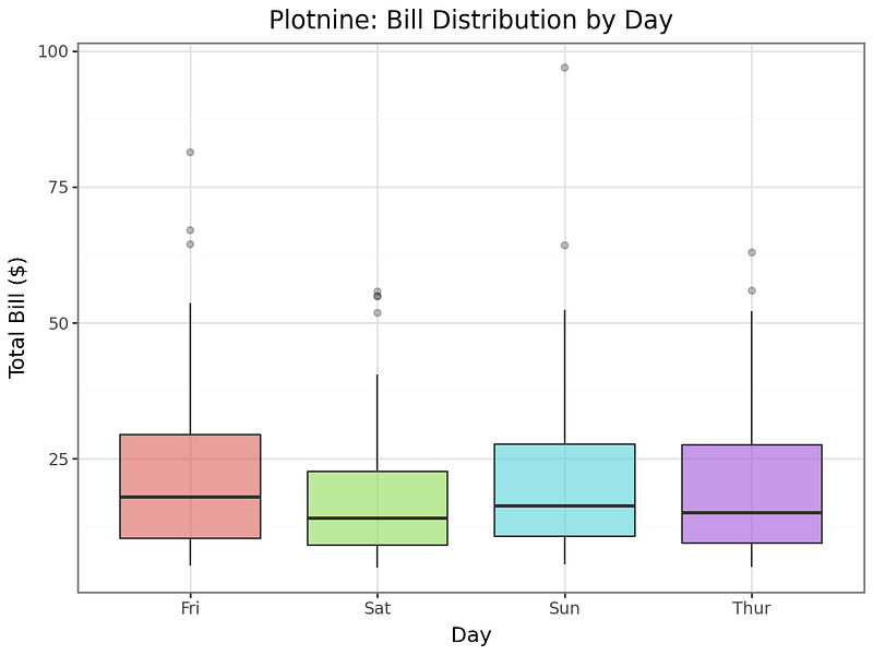
Seaborn
Website: https://seaborn.pydata.org
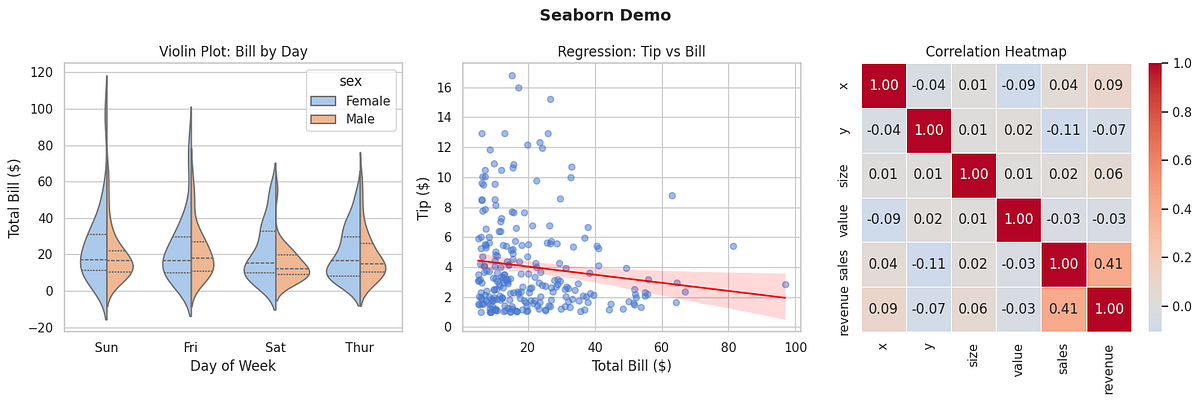
Seaborn wraps Matplotlib with a cleaner API specifically designed for statistical graphics. It ships with built-in support for violin plots, pair plots, heat maps, regression plots, categorical plots, and distribution visualizations. Its default themes are also considerably more attractive than raw Matplotlib defaults.
The library integrates naturally with Pandas DataFrames. You pass your DataFrame and the names of the columns you want to use, and Seaborn handles the grouping, aggregation, and styling. This makes exploratory data analysis much faster than building the same charts from scratch in Matplotlib.
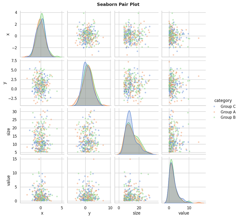
One important thing to understand: Seaborn produces static Matplotlib figures. You can still use the full Matplotlib API to customize or save them, but they are not interactive in the browser sense.
Best for: Exploratory data analysis, statistical summaries, quick beautiful charts, pair plots and correlation heatmaps.
Plotnine
Website: https://plotnine.org
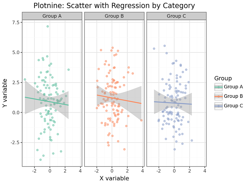
Plotnine is a Python implementation of R’s legendary ggplot2 library, following the Grammar of Graphics philosophy introduced by Leland Wilkinson. The core idea is that a chart is built by layering components: data, aesthetic mappings, geometric objects, scales, coordinate systems, and facets.
If you have a background in R or have read “The Grammar of Graphics,” Plotnine will feel immediately familiar. If you have not, it takes a short adjustment period, but many users find that it changes how they think about chart construction in a productive way.
Building a faceted scatter plot with a regression line across multiple categories, for example, takes only a few lines of composable code. Adding or removing elements is a matter of adding or removing layers rather than rewriting logic.
Best for: R users transitioning to Python, faceted multi-panel charts, grammar-of-graphics workflows, reproducible exploratory analysis.
Altair
Website: https://altair-viz.github.io

Altair is a declarative visualization library based on the Vega-Lite grammar. The idea is that you describe the chart you want using a JSON-like specification, and the library handles rendering. You say what you want to see, not how to draw it.
Altair charts are interactive by default and render in Jupyter notebooks as rich HTML. Linking charts together so that selecting points in one chart filters another is straightforward. This makes it a strong choice for building interactive exploratory interfaces directly in notebooks.

The library works best with tidy (long-format) DataFrames where each column is a variable and each row is an observation. If your data is already in that shape, Altair is remarkably expressive for the amount of code it requires.
Best for: Declarative interactive charts, linked selections across multiple charts, tidy data workflows, sharing self-contained HTML charts.
Group 3: Interactive and Web-First Libraries
These libraries are designed from the ground up to produce interactive, web-native charts. They are the right choice when your audience will be viewing results in a browser and you want them to be able to explore the data themselves.
Plotly Express
Plotly Express is the high-level interface to the Plotly library. It was designed to make interactive charts as fast to create as static ones. A chart that would take dozens of lines in the core Plotly API typically takes one or two with Express.
The function signatures mirror the Pandas-friendly style that many users know from Seaborn: you pass a DataFrame and specify which columns map to x, y, color, size, facet, animation frame, and so on. The result is a fully interactive Plotly figure.

Plotly Express is also the native charting library for Dash, the dashboarding framework from the same team. If you are building a Dash app, Express is the natural pairing.
Best for: Fast interactive charts, animations over time, anyone already using Plotly or Dash.
Bokeh
Website: https://bokeh.org
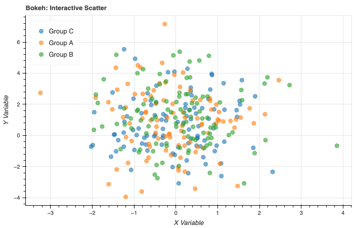
Bokeh is built for creating interactive visualizations for the web. It generates HTML and JavaScript output and integrates well with Jupyter notebooks, standalone HTML files, and server-backed applications using Bokeh Server.
What distinguishes Bokeh is its widget system. You can attach sliders, dropdowns, text inputs, and buttons to your charts and wire them together with Python callbacks. This makes it possible to build fairly sophisticated interactive tools without writing JavaScript.
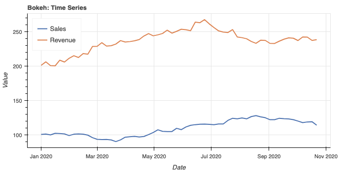
Bokeh also handles streaming data well, which makes it a good choice for monitoring dashboards that update in real time. The library sits at the core of the HoloViews ecosystem and serves as the default backend for hvPlot.
Best for: Embedding interactive charts in web pages, interactive tools with widgets, real-time streaming data, integration with Panel and HoloViews.
HoloViews
Website: https://holoviews.org

HoloViews takes a data-centric approach to visualization. Rather than writing code to draw a chart, you annotate your data with metadata describing its semantics, and the library figures out a reasonable visual representation automatically. You can then compose multiple elements using simple operators.
For example, you can overlay two plots with *, lay them out side by side with +, and get a grid of plots across parameter combinations with NdLayout. The library supports Bokeh, Matplotlib, and Plotly as backends, so you can switch rendering engines without rewriting your analysis.
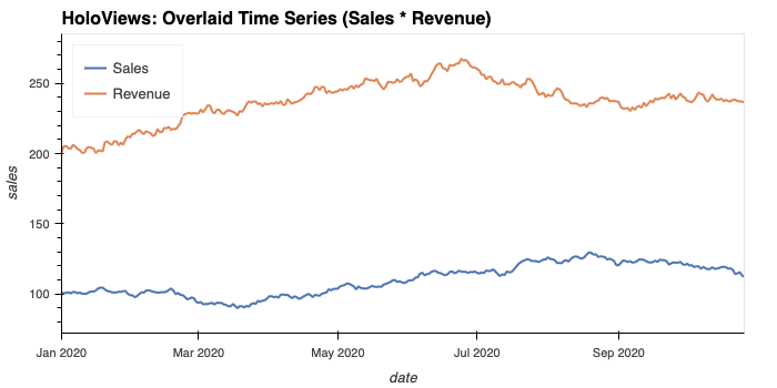
HoloViews shines when you are exploring multidimensional datasets and want to quickly generate different slices and views without a lot of boilerplate.
Best for: Multidimensional data exploration, composing complex layouts from simple elements, notebook-based interactive exploration.
hvPlot
Website: https://hvplot.holoviz.org

hvPlot is a high-level plotting API built on top of HoloViews that extends the familiar Pandas .plot() API. You import it, and your DataFrames gain a .hvplot accessor that produces interactive charts instead of static ones.
The learning curve is very low if you already know Pandas plotting. The main upgrade is that the resulting charts are interactive Bokeh or Plotly figures rather than static PNGs.

hvPlot also works with xarray, GeoPandas, Dask, and Streamz, making it a flexible choice across data formats.
Best for: Quick upgrade from Pandas static plots to interactive ones, xarray and Dask users, fast exploratory analysis.
Group 4: Large Data Rendering
Standard plotting libraries start to struggle when your dataset has millions of rows. These tools are built specifically for that scale.
Datashader
Website: https://datashader.org

Datashader is designed to make large datasets visible. The standard approach of plotting a scatter plot with a million points fails in two ways: it is slow, and the resulting chart is an unreadable blob of overlapping dots.
Datashader solves this by rasterizing the data server-side before sending it to the screen. It bins all the points into pixels, aggregates the values within each bin (counting points, averaging a value, etc.), and produces a color-mapped image. The result is a fixed-size image regardless of dataset size, and the coloring accurately reflects data density.
It integrates with HoloViews and hvPlot so you can combine it with interactivity: as you pan and zoom, Datashader re-renders only the visible portion of the data.
Best for: Scatter plots with millions of points, time series with high-frequency data, any situation where overplotting makes charts unreadable.
Group 5: Geospatial Visualization
Plotting data on maps requires specialized tools that understand geographic coordinates, projections, and tile services.
Folium
Website: https://python-visualization.github.io/folium
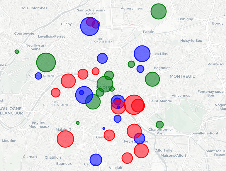
Folium wraps the Leaflet.js mapping library for use in Python. It produces interactive maps that you can embed in Jupyter notebooks or export as standalone HTML files.
Adding markers, popups, choropleth layers, heat maps, and cluster layers is straightforward using a clean Python API. The tiles come from OpenStreetMap and other providers by default, but you can configure other tile sources.
Folium is probably the easiest way to get a geographic data visualization into a Jupyter notebook quickly. It does not require any geographic expertise or understanding of projections.
Best for: Interactive maps in notebooks, markers and popups, choropleth maps, sharing as HTML.
GeoPandas
Website: https://geopandas.org

GeoPandas extends Pandas DataFrames to support geometry data: points, lines, and polygons. It can read common geospatial formats like Shapefiles and GeoJSON and provides a .plot() method that produces static maps with Matplotlib.
It is the standard tool for working with vector geographic data in Python and is commonly used together with other mapping libraries for more interactive output.
Best for: Reading and manipulating geospatial data, static choropleth and geometry plots, combining with Folium or hvPlot for interactivity.
Group 6: Specialty and Domain-Specific Tools
Some visualization tasks are common enough to deserve their own dedicated library, but specialized enough that general-purpose tools handle them poorly.
Missingno
Website: https://github.com/ResidentMario/missingno

Missingno is a small, focused library with one job: visualizing missing data in a DataFrame. It provides a matrix view that shows where nulls are distributed across rows and columns, a bar chart of completeness per column, a heatmap of co-occurrence of missing values, and a dendrogram that clusters columns by their null patterns.

These visualizations are surprisingly useful at the start of any data cleaning project. Understanding whether missingness is random or systematic changes the approach to imputation or removal significantly.

Best for: Data quality assessment, understanding missing value patterns before cleaning.
PyWaffle
Website: https://pywaffle.readthedocs.io
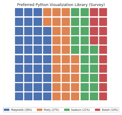
PyWaffle extends Matplotlib to produce waffle charts: grids of squares or icons where each unit represents a proportion of a whole. They are an alternative to pie charts that many designers prefer because they are easier to read at a glance, especially for comparisons across multiple groups.
The library supports custom icons (using FontAwesome), multiple categories, custom colors, and various layout options.

The resulting figures are standard Matplotlib objects, so they compose well with the rest of the Matplotlib ecosystem.
Best for: Showing part-to-whole relationships, proportional comparisons, presentation-friendly alternative to pie charts.
NetworkX
Website: https://networkx.org

NetworkX is the standard Python library for working with graphs and networks. It provides tools for creating, analyzing, and visualizing graph structures: social networks, dependency graphs, knowledge graphs, road networks, and any other data that can be modeled as nodes connected by edges.
For visualization, NetworkX uses Matplotlib as its rendering backend. It offers several layout algorithms including spring layout, circular layout, spectral layout, and shell layout.

For more elaborate interactive network visualization, NetworkX data can be exported to other tools like PyVis.
Best for: Network and graph analysis, dependency visualization, social network exploration.
Group 7: Dashboarding Frameworks
These tools let you turn your Python data analysis into live, interactive web applications. They are a step beyond charts in a notebook: they produce apps that non-technical users can interact with.
Streamlit
Website: https://streamlit.io
Streamlit is the most popular Python dashboarding framework by a wide margin. The model is simple: you write a Python script top to bottom, use Streamlit’s widget functions to add interactivity, and run streamlit run app.py. The library takes care of the rest.
It is opinionated and fast to get started with. You sacrifice some layout control in exchange for dramatically reduced development time. Most simple dashboards can be built in an afternoon.
Best for: Fast prototypes, simple internal tools, sharing analyses with non-technical stakeholders.
Dash
Website: https://dash.plotly.com
Dash is Plotly’s dashboarding framework and is built on Flask, React, and Plotly.js. It gives you more layout control than Streamlit and handles complex multi-page applications with callbacks that can update charts based on user input.
The callback system is more explicit than Streamlit’s rerun model, which makes it better suited for large, complex applications but steeper for quick prototypes.
Best for: Production-grade dashboards, complex interactivity, multi-page apps, tight integration with Plotly charts.
Panel
Website: https://panel.holoviz.org
Panel is part of the HoloViz ecosystem and is the most flexible of the three dashboarding frameworks mentioned here. It works with virtually any Python visualization library: you can wrap Matplotlib figures, Plotly charts, Bokeh plots, and HoloViews objects all in the same app.
Panel also has strong support for Jupyter notebooks, which makes it possible to develop and deploy from the same environment. It supports both a reactive widget model and a callback-based model.
Best for: Multi-library dashboards, teams already using HoloViews or hvPlot, Jupyter-native workflows.
Choosing the Right Tool
Here is a simple decision guide based on your situation.
If you need static charts for a report or paper: start with Matplotlib for control, or Seaborn for statistical plots, or Plotnine if you come from an R background.
If you need interactive charts in a notebook: Plotly Express is the easiest entry point. Altair is excellent if your data is tidy and you want linked selections. hvPlot is the fastest upgrade if you are already using Pandas.
If you have very large datasets: add Datashader to whatever interactive library you are using.
If you need a map: use Folium for quick interactive maps, GeoPandas for static geographic plots.
If you need a dashboard: Streamlit for speed, Dash for production complexity, Panel for maximum flexibility.
A Note on the PyViz Ecosystem
Most of the interactive libraries mentioned in Groups 3 and 4 (Bokeh, HoloViews, hvPlot, Datashader, Panel, and GeoViews) come from or are coordinated by the HoloViz project. This means they are designed to work together. You can start with hvPlot for quick exploration, add HoloViews for composability, pipe large data through Datashader for performance, and deploy the result with Panel, all using a consistent set of APIs.
This integration is worth knowing about when you are building a workflow rather than a one-off chart.
Resources
- PyViz tools catalog — The most comprehensive and up-to-date list of Python visualization libraries
- PyViz overviews — Articles and comparisons across many libraries
- Python Graph Gallery — Examples of chart types with code across multiple libraries
- Matplotlib documentation
- Seaborn documentation
- Plotly Python documentation
- Altair documentation
- Bokeh documentation
- HoloViews documentation
- hvPlot documentation
- Datashader documentation
- Folium documentation
- NetworkX documentation
- Missingno on GitHub
- PyWaffle documentation
All code examples for every library in this article are available in the companion Jupyter notebook available on my github via: www.wajdibensaad.com


