Data Mining basic and advanced concepts - Part 2 : Describing Data
Central tendency answers a key questions:
How Data is spread out?
Calculating the numbers and putting them into a table is helpful, but the best way to make sense of these numbers is to put them in graphics!
First we start by calculating the most important things: Mean, Median & Mode.
I advise you to read the post about the Mean Median and Mode.
The best way to understand data is to visualize it throw graphics. The best graphic to understand the central tendency of a data-set is the Box-Plot (see the Wikipedia Page ) .
Box-plots are generally referred to as the first descriptive statistics visualization that any data analyst should plot in order to get the first feel of the data structure.
Reading a Box-Plot
I have found a very nice graphic in the Flowing Data website that I wanted to include here (link to the full post about box-plots)
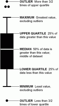 |
| Reading a Box-Plot (source: Flowing Data website) |
The Box-plot gives an idea about the spread of data, It splits our data set into groups called quartiles. The Box of the Box-plot is a rectangular shape that is delimited by the first Quartile and the third Quartile Q3
In the box, a line is drawn vertically at the Q2, It is the median.
The whiskers are two lines drown horizontally that extend from the front and back of the box. The front whisker goes from Q1 to the smallest non-outlier in the data set, and the back whisker goes from Q3 to the largest non-outlier.
But why should we care about Box-plots? here are the most important reasons :
- The Box-plot is an Indicator of Spread
By the spread of data we mean how our observations are spread in our interval. For the example bellow, the 2 Box-plots are centered on the value 12, but Box-plot 1 is more spread to the left, which means that this data set has more values that are closer to 0, while the Box-plot 2 has values that are more centered around the value 12, with little or less values to the right.

- The Box-plot is an Indicator of Centrality
Theses Box-plots bellow can be compared based on the difference of their centers.

- The Box-plot is an Indicator of Symmetry
This graph is self explanatory I think!

- The Box-plot is an Indicator of Tail Length
Simply put, the longer the tail, the more outliers we have in the data. The Box-plot is a very good visual way to tell the structure of the data set and to easily investigate the existence of outliers.

The most important part is how to understand a box-plot, or how to visually read it. There are a specific set of information that might interest us in a Box-Plot:
If we want to understand the spread of our data, we should care about the range. The range is represented on a Box-Plot by the horizontal distance from the smallest value to the largest value, and that is including any outliers that might exist
In a Box-Plot, the interquartile range is represented by the width of the box (Q3 minus Q1), and it would give a good idea of how the data is distributed.
Next we would be interested by checking the skewness of our data. To keep it simple, bellow a graph with the corresponding skew for each form of Box-plots :

Your comments and questions are always welcomed !


